

Fontasy Island
The same written word can convey an entirely different perception all with the tweak of a font or the absence of a serif.
Fontasy Island
The same written word can convey an entirely different perception all with the tweak of a font or the absence of a serif.
It’s no secret: I love fonts and I know I am not alone on this wonderful island!
In typography, a typeface (also known as font family) is a set of one or more fonts each composed of glyphs that share common design features. Each font of a typeface has a specific weight, style, condensation, width, slant, italicization, and/or ornamentation.

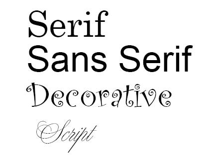
The four most well-known category of fonts or typefaces are:
- Serif
- Sans Serif
- Decorative
- Script
Here’s a bit of information about the first two, which are the most-widely used type of fonts.
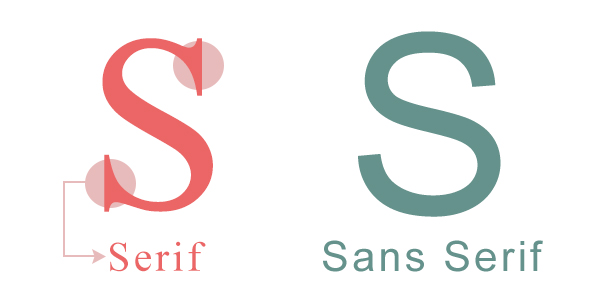
Serif fonts are among some of the oldest modern typefaces. A serif is the extra little stroke, those little curves, at the ends of letters.
Sans serif fonts are considered more modern and include a variety of widths and shapes. “Sans” literally means “without,” so a sans serif font does not include any extra stroke at the ends of the letters.

It is my job as a designer to choose the right font for each project. And the best font choices are the ones where the reader doesn’t notice the font, but the actual message of the piece.
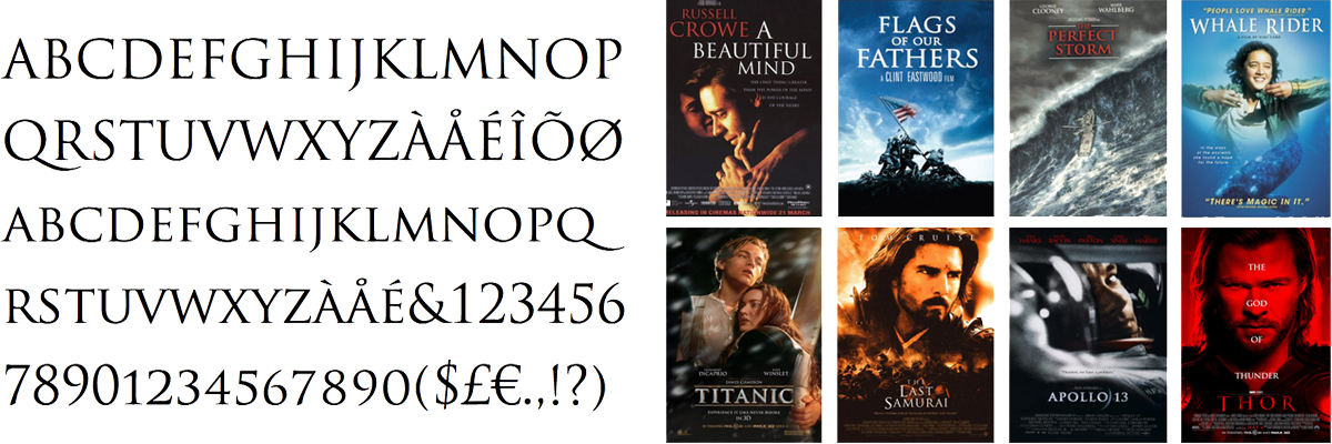
Now that you have a better feel for the typographical differences, I would like to share with you an old favorite of mine that you've almost certainly seen around: TRAJAN. It’s a font that is mainly used for titles, headlines or sub heads. If it is used as body copy it can be very difficult to read, so be gentle with it.
Trajan has an interesting, albeit fairly young history. Wikipedia states, “Trajan is a serif typeface designed in 1989 by Carol Twombly for Adobe. The design is based on the letterforms of capitalis monumentalis or Roman square capitals, as used for the inscription at the base of Trajan’s Column from which the typeface takes its name. Trajan is an all-capitals typeface, as the Romans did not use lower-case letters. Twombly created the design taking inspiration from a full-size picture of a rubbing of the inscription. It is well known for appearing on many movie posters.”

I mean, just look at all the movie titles in Trajan! In truth, this is why you'll sometimes find people complaining that it's become overused, particularly in the film industry. A fair point, but I'm still defending Trajan as a classic font that gives clarity and beauty to modern printed materials. It's not as "hip" as many sans serif fonts, but it conveys stability, professionalism, and strength. So if you use Trajan on your marketing or advertising material, no one will every accuse it of being “Da plain! Da plain!”
(And if you didn’t pick up the Fantasy Island references, I'd recommend you go check out the coolest TV show ever to come out of the 1970s!)
Topics
More from Jodi Miller
Keywords
- Graphic Design
- Print Media
- Print Advertising
- Branding
- Fonts
- Typeface


 Addis Enterprises LLC.


